Inspiration Doesn’t Strike…

You have to work for it.

At least, that’s my experience. Maybe that means I’m not very creative. Actually, I’m quite certain that I’m not very creative. I am analytical to a fault, and indeed, many of my blog series (The Name of the Grain and Woody Wednesday, for example) as well as my job title (Forest Resource Analyst) reflect that. Perhaps that’s why I naturally gravitate towards historical furniture forms. There is something comforting about building furniture in a tradition that incorporates the evidence of a thousand years of failures and successes. Why re-invent the wheel when it’s already been refined by countless generations of craftsmen more competent in their trade than I can ever dream of being?

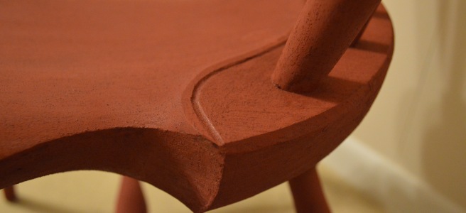
More often than not, when I find myself departing from tradition, it’s to accommodate a special piece of wood that simply doesn’t fit into the classical canon of furniture forms. Such is the case with my current project. My dad asked me to build an end table. He already had the wood picked out for the top – a slab of white oak 15″ wide, 40″ long and 1-5/8″ thick. It’s a lovely piece of wood, cut from a crotch with plenty of flame figure – but it also has plenty of defect.

The wood was cut in a manner that is opposite from the way that a crotch would normally be sawed. Woods like walnut, cherry, and birch normally display the best figure when the crotch is sawed, as my old friend Tom would say, “like a pair of britches lying flat on the floor” – with each fork representing a leg. Oak, on the other hand, usually presents the best figure when the wood is sawed perpendicular to the customary orientation.

Log drawing
Typical method for sawing oak crotch. Note that this is the opposite from the usual method.

The problem with this method is that it includes the pith in every flitch. Anyone who has ever sawed their own hardwood lumber is well aware of the problems with the pith. The juvenile wood immediately adjacent to the pith often has a life of its own, bending and twisting as it dries. And the nature of wood shrinkage means that the odds are good that you’ll have cracks in any board that includes the pith. My dad’s slab was no exception.

Oak Crotch
The slab of wood at issue.

Fortunately, the slab was large enough to salvage a sizable chuck of wood while completely discarding the pith. The result was an elliptical tabletop, 13″ wide and 24″ long.

Ellipse
Keep the best, chuck the rest.

The problem, at this point, was that I had very little historical precedent to work with for designing the base. Oval end tables – especially tables that utilize a piece this thick – are scarce. Now, this isn’t the first time I have found myself in “modern furniture” territory. I detailed my design process for my tripod kitchen table in the early annals of this blog. Basically, it involved typing some descriptive keywords into a Google image search, plucking out a few designs that I really liked, and modifying them to suit my preferences. In this case, however, Google was of no help, and I found myself starting from an empty slate.

So, I did the only thing a non-creative person can do in this situation: I sharpened my pencil and got to work. I started sketching stream-of-consciousness until I stumbled upon an idea worth pursuing. I’ll warn you, the process (or maybe just my sketching ability) isn’t pretty:

Most of the sketches belong exactly where they are: on the cutting room floor. But I thought that the sketch at the bottom right of the first page had potential, so I explored it further on a second page, playing around with the dimensions of the members as well as the horizontal and vertical proportions of the whole structure. I really liked the way the curves flowed through the joinery and the arch at the bottom reflected the ellipse of the top. I decided this design was the winner.

Full-Size Sketch
I’m too lazy for prototyping, but a full-size drawing is time well spent.

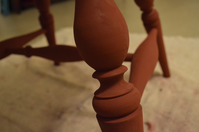
It was time to make full-size drawings – a step that I rarely take, but I felt that it was necessary to get a realistic idea of the proportions. My first iteration, with 3″-wide members, was a bit to heavy, so I revised the drawing to 2″ members. That looked right to my eye, and I was satisfied enough with this drawing to begin the painstaking process of animating the idea in ligneous flesh.

Layout

But as always, the ultimate question is not “Does it look good on paper?”

The Finished High Chair

I took a couple of evenings earlier this week to get the continuous-arm high chair finished up. I was pretty dissatisfied with the effect of the black milk paint on my chair from last fall, so I decided to go back to where I began. A couple of years ago, I bought a cheap, falling-apart factory-made Windsor chair from an “antique” store in Mississippi. I took it completely apart and re-shaped every one of the ill-conceived parts into a more pleasing and historically sympathetic form. Upon re-assembly and finishing, the chair immediately became one of my favorites and has graced our dining room table ever since.

On that chair, I used homemade red milk paint as the base coat using red iron oxide as the pigment. That paint turned out lovely. I then tried to concoct some black milk paint using powdered charcoal as pigment. I may as well have painted it with dirty dishwater. The milk paint didn’t have enough substance to provide the opacity required to achieve good coverage. Fortuitously, I found that a bit of finely powdered charcoal mixed with shellac created a lovely black paint, and the finish has held up well and aged beautifully over the past couple of years. Hence, I determined to re-create the same finish on the high chair.

With the red milk paint fully cured over the weekend, I gave it a good rubbing down with a crumpled brown paper bag to achieve a lovely low luster. I find that milk paint performs far better when allowed to cure a few days before rubbing it out. Too soon, and you’ll just wear through the finish. I don’t always have the time or the patience to wait, but three or four days is optimal.

With the milk paint readied, I proceeded to mix up my shellac paint as best as I could remember. The charcoal powder I procured some years earlier from a pyrotechnic supplier. It was dirt cheap – around $25 for 5 lbs worth – and should last me several lifetimes (if I live that long). It is not as finely ground as lampblack, a more common black pigment which can also be obtained from pyrotechnic suppliers. I sifted the charcoal through a reusable brass mesh coffee filter prior to mixing, to remove the coarser bits. A mortar and pestle would be welcome, but I don’t have one.

Tinted Shellac Supplies

I found that a ratio of 1-2 tsp. of charcoal per 1 Tbsp. of shellac (orange, 3-lb cut) made a serviceable paint. A bit of experimentation is required to achieve the proper consistency, but if you get it right, it will go on quite smoothly with a synthetic bristle brush. I use a 1-1/2″ brush for the larger surfaces and a cheap artist’s brush for the nooks, crannies, and spindles.

Tinted Shellac Applied

The finish should not be applied too thickly or it will orange-peel, just like straight shellac. But you can apply multiple thin coats in fairly quick succession. I put two coats on in one evening, then allowed it to cure overnight. You do not want to begin rubbing the shellac until it is fully cured. A Scotch-Brite pad and some judicious use of 400-grit sandpaper on some stubborn rough patches yielded a lovely smooth satin sheen.

Burnishing Tinted Shellac

Finally, I topped off the shellac with a coat of tinted oil. The finish was nothing more than a bit of charcoal powder mixed with boiled linseed oil. To be truthful, I should have skipped the tinting altogether. The charcoal did not seem to add any coverage to the finish – rather, it only served to make the chair messy and annoying to handle until the oil was fully cured. Next time I’ll skip the tinting and just apply pure BLO or a thin wiping varnish.

Tinted Linseed Oil

I can’t say that the finish is perfect. There are some spots that are too thick, and some rough patches that I simply ran out of the will to smooth. But I can say with certainty that it is the best finish I have achieved yet on any of my chairs. The new owner is equally pleased and was rather excited to eat his bowl of cereal while seated upon his new perch this morning.

Continuous-Arm High Chair Rear Quarter View

A Tour of the Aiken-Rhett House

Live oaks draped in Spanish moss. Sprawling mansions with double porches. Centuries-old masonry cloaked in creeping fig. Criminally deficient parking. All of this awaits you in beautiful and historic Charleston, South Carolina.

My wife and I (as well as our 4-month-old son) visited this weekend to attend the Lie-Nielsen Hand Tool Event and to take part in a tour of the Aiken-Rhett House. Unfortunately, I misread the dates on the tour arranged by Lie-Nielsen, and realized too late that the tour actually took place on Thursday, April 7, not on Saturday, April 9. Oops. After spending about an hour at the Lie-Nielsen Hand Tool Event (which was as much as I dared inflict upon my poor wife), we decided to take the house tour by ourselves. Though I was disappointed that the tour would not be led by a prominent local furniture conservator, the independent headphone tour proved well worth 12 bucks.

You can read a more comprehensive background of the house at the Historic Charleston website, but I’ll give you the short version here: The house was built ca. 1820 by wealthy Charleston merchant John Robinson. He fell on hard times and was forced to sell the house to William Aiken, Sr., who passed the home on to his son William Aiken, Jr. The younger Aiken would go on to become one of the governor of South Carolina and one of Charleston’s wealthiest residents. After he died in 1887 and his wife in 1892, the home passed on to their daughter, who passed it on to her sons, who lived in the home until the mid-1900s. In 1975, the home was sold to the Charleston Museum.

Remarkably, the home passed through the hands of only three generations of the same family between 1833 and 1975. Very few alterations have been made to the house since the mid-1800s. The current owner -the Historic Charleston Foundation – has taken a preservation, as opposed to a restoration, approach to the home’s maintenance. As a result, the tour gives you an incredible, time-weathered feel for the original grandeur of a historically significant Greek revival mansion. I have toured many old homes, and I can say that the only time I have walked away similarly impressed was after my visit to Longwood Plantation in Natchez, MS. In short, I highly recommend the tour if you ever happen to find yourself in the vicinity of Charleston.

The pictures of the home are probably more interesting than any more of my drivel, so I’ll just post a few of my photos with a brief description.

*Side note: if you’re viewing on a device larger than a smart phone, I must offer an apology for the quality of the pictures. In an attempt to economize my time, I tried some new bulk photo compression software, and it really made a mess of my photos. I didn’t notice how bad the quality was until after I had already deleted the originals. Mea culpa. I almost hesitated to even write this post, but the pictures look fine on a smartphone, and I figure that’s how half of you will be reading it, anyway…

Charleston 026
Front facade – the iconic two-story wraparound porch, so familiar in Charleston.
Charleston 030
A cute, simple child’s Windsor chair in the kitchen. Notice the awesome andirons in the background also.
Charleston 032
A peak inside the joinery of a kitchen table. Double-pegged mortise and tenons, with a cut nail driven through the top and into the leg to secure the top.
Charleston 034
Full view of the kitchen table.
Charleston 035
This diminutive chest has seen better days. From the slaves’ quarters.
Charleston 036
Detail of a cupboard from the slaves’ quarters. Heart pine, ship-lapped door boards, mitered cock-beading, and a nice cornice. The furniture of the kitchen and slaves quarters would find far more widespread appreciation today than anything in the main house. Funny how time changes things.
Charleston 040
Carriage house and courtyard
Charleston 041
The woodwork in the carriage house. The horses enjoyed a home with finer woodwork than people today.
Charleston 045
I love the simple, functional beauty of a wagon wheel.
Charleston 046
Gorgeous black finish on these finely-shaped balusters.
Charleston 049
Fine plaster work on the parlor ceiling.
Charleston 051
The parlor still retains much of its original early 1800s furniture.
Charleston 052
Wide frames-and-panels surrounding the windows. One of the joys of a stone building.
Charleston 053
Ghostly grandeur
Charleston 058
Odd little baluster profile that is quite common in Charleston. Rather than the more conventional square section at the top (to match the bottom), the top of the baluster is turned down to a ~1″ tenon, which fits into a round mortise underneath the porch rail. Certainly more economical of labor, but I’m not a big fan of the look.
Charleston 061
I have never been a huge fan of Greek Revival furniture, but seeing this dining table and its chairs at home in the mansion for which it was purchased provided a different perspective. They look quite at home in this room.
Charleston 062
Fantastically detailed staircase. These are the servants’ stairs, believe it or not.
Charleston 074
Detail of the balusters and newel post. 
Charleston 069
Gorgeous vanity with crotch mahogany-veneered drawer fronts.

So, If You’re Going to Be in Charleston this Weekend…

…You should probably go ahead and book tickets to the special tour of the Aiken-Rhett house, arranged by Lie-Nielsen. I’ll be there! Think of how exciting it will be to finally meet a real, live blogger! And also, there will apparently be lots of decrepit furniture and a shabby old historically significant house and whatnot (if you’re into that sort of thing).

Chris Schwarz wrote about this event back in 2014, which you can read here. The details about the event (and the Lie-Nielsen Hand Tool Event which runs concurrently) can be found at the Lie-Nielsen website. And you can read more about the Aiken-Rhett house at their website, here.

Aiken-Rhett House Museum Tour

Date & Time: April 7th, 2016 (2:00pm to 3:00pm)

Location: 48 Elizabeth St. Charleston, SC 29414

Cost: $12 per person

Tour Details:

We’ve arranged a special tour of the Aiken-Rhett House Museum, a landmark historic home located at the corner of Judith and Elizabeth streets in Charleston.The Aiken-Rhett House was built in 1820, and remained in the hands of family and decedents for 142 years. Its rooms retain objects and decorations original to the home and its early occupants. Visitors will tour the home and its outbuildings, and experience the history contained therein.

We will meet at the Aiken-Rhett House Museum at 1:30pm on Thursday, April 7th. The tour starts at 2pm and lasts about one hour. If you are interested in joining, please call us at 1-800-327-2520 or email us at: toolworks@lie-nielsen.com to reserve your spot. Cost of admission to the museum is $12 per person. After the tour, at 4pm, we’ll head over to the American College of the Building Arts for a presentation by local furniture conservationist Russell Buskirk, followed by dinner and beers at the Craftsman Tap House at 6:30pm.

I know it’s a long shot, but if you’re planning to attend, let me know and I’ll be on the lookout for you. Living in the Deep South affords precious few opportunities to get a closeup perspective on early American furniture, so I plan to soak in as much of the experience as I can. Hope to see you there!


Final Chapter on the Tavern Table

Wow, I see that almost a month has passed since my last post on the tavern table. Hard to believe it’s been that long, but I’ve finally completed the finish after pecking away at it on evenings and weekends. I honestly think it may be the last time I use milk paint for a long while. I love the results, but it is ridiculously labor-intensive. Look for some experimentation with alternatives – oil paints and tinted shellac – in future blog posts.

When I left off, I had just burnished the second coat of ‘Goldenrod’ and applied a layer of orange shellac.

IMG_20160209_221831480

It’s a bit gaudy to modern eyes at this point, though I believe a color similar to this was pretty popular for Windsor chairs in the late 1700s (those folks liked brighter colors than we tolerate today).

The next step was to cover the Goldenrod with a couple coats of ‘Peacock’.

Tavern 001

Originally, my plan was to paint the top the same color as the base, but once I got the Peacock on the base, I realized that the table actually looked really good with a contrasting top. I decided that a layer of red paint, judiciously rubbed through to the yellow below, might look even better.

Rather than marching forward with more milk paint, I decided to experiment with some oil paint instead:

IMG_20160213_083149700
Making oil paint does not require fancy materials. I used some boiled linseed oil, red iron oxide pigment, and turpentine. (Long-time readers might know that I’ve complained about boiled linseed oil before due to its metallic dryers, but its rapid drying time was too tempting in this case for a project that has already dragged on for far too long.)
IMG_20160213_083614630
I don’t have a fancy glass muddler, but a glass bowl and a teaspoon seems to work fine. I used 1/4 tsp. pigment, 1 tsp. oil, and 1/2 tsp. turpentine. I made that up on the spot, so don’t make the mistake of assuming that there is any magic behind those proportions. It did make a fine paint of good consistency.
IMG_20160213_084206511
I gave the top a washcoat of Peacock, which dried overnight before I used the oil paint. The effect of layering different colors gives a natural irregularity to the color, which I enjoy.
IMG_20160213_084605511
And here is the tabletop with two coats of the red paint. Quite nice, I think. I like this much more than a solid-color table.

The final step was to rub down the whole table with Scotch-Brite pads. I tried to simulate age by rubbing through the top coat in predictable locations: around the drawer knob, on the corners and edge of the top and legs, and especially on the tops of the stretchers where feet should rest. I stopped short of “distressing” the piece with dents, scratches, rasping, and sanding. I don’t have the willpower to spend the time on a good and realistic distressed finish, and a poorly distressed piece (AKA “shabby chic”) is, shall we say, not to my taste.

Tavern 004

Finally, after an hour of burnishing, the table was ready for its final coat: a layer of home-brewed wiping varnish (1/3 boiled linseed oil, 1/3 satin oil varnish, 1/3 turpentine).

The final coat highlighted my second major annoyance with milk paint (the first being labor): It changes color dramatically when the oil is applied. I quite liked the blue-green appearance of the unfinished milk paint. But the second you apply the varnish (or oil, or shellac, or any other protective finish), the color darkens more than you might expect.

Tavern 001
Before Varnish
Tavern 005
After Varnish

Now, don’t get me wrong: I’m quite happy with the final appearance of the table. I’m just annoyed that I couldn’t predict how it would look until after the varnish was applied. If I had a specific color that I was trying to match, I would have been far more annoyed. The nice thing about oil paints and tinted shellac is that the color looks pretty much the same when it’s mixed, when it’s going on, and when it dries. Milk paint, on the other hand, has one shade when you mix it, a different shade completely when it dries, and yet another completely different shade when you finish it. Unless you are deeply familiar with the product, it’s just unpredictable.

Anyway, enough of my ranting. How about some glamour shots of the finished table?

This slideshow requires JavaScript.

A Tale of Two Tripod Tea Tables

(And a lot of alluring alliteration?)

I mentioned yesterday that I ran into something interesting at the antique store on Sunday. Of course, it may only be of interest to me, but I hope not, because I spent a couple of hours writing about it.

Rural southern antique stores tend to yield some peculiar offerings. (I’m sure it’s the same everywhere; I can only speak to my own experience). But every now and then you come across something worthwhile, which keeps the experience fun. If nothing else, it’s an opportunity to pull out drawers and peek inside of carcases in ways that museums and your neighbors might disapprove. The store that I visited on Sunday had a couple of mahogany tea tables that were worthy of a closer look.

(Actually, only one of them was worth a closer look, but I thought it might be helpful to compare an interesting one with a non-interesting one, side-by-side)

IMG_0730

What is your first impression when you see the tables in the photo above? (Feel free to comment, because I’m curious what jumps out at other furniture-makers).

The tables are similar in their basic form: tripod tables, with legs joined to a central column, comparable in height, diameter, and footprint. But the differences are instantly apparent. The table on the left has a more pleasing finish: it looks smooth and matte, allowing the color and grain of the wood to take center stage. The table on the right has a glaring finish that obscures the wood and distracts the eye from the form. The table on the left has an attractively-shaped top, with a raised edge accented by six decorative C-scrolls. The table on the right has plain, round top with no raised edges.

That is where the credits to the table on the left come to an end. Looking below the top, we see that the right table has shapely, almost muscular legs. They look active and alive compared to the drooping, blocky legs on the table to the left.

More on the legs later. For now, let’s have a look at the columns (apologies, though, for the quality of these photos).


Though superficially similar, the turning on the right is far more competent and cohesive than the one on the left. On the column to the right, the variation in diameters is more dramatic and the separation of the various elements more assured. The column on the left features redundant repetitions of the elements above and below the urn; it lacks the punctuating bead on the upper portion of the taper; and the transition from the tapered section atop the urn to the wider part that supports the tabletop is slow and uncertain.

Now, back to the top for a closer inspection.

IMG_0733

The plasticky film of polyurethane notwithstanding, the top of this table is a nice piece of wood. I didn’t measure it, but I would estimate it to be ~26″ wide from a single plank of solid mahogany. I will criticize the rim, however. Not every tea table can have a laboriously-carved pie crust top, but this table would definitely have benefited from a turned, raised edge.

The other table has a nicely carved edge, but all is not as it seems…

IMG_0745

Notice in the picture below, the tell-tale clue of veneer separation:

IMG_0740

And of course, if you examine the edge, you’ll see the sandwich of applied carvings, mahogany veneer, solid wood, followed by another layer of delaminating veneer. The shaping of the edge below the applied moldings is pretty half-hearted as well.

IMG_0741

Alright now, let’s flip these things upside-down and take a look underneath:

If you haven’t figured it out by now, the story starts to unfold with these two photos. On the photo at left, look at how the leg is beginning to separate from the column. You can peek in (well, I could) and see the dowels that join the legs to the columns. Dowel joints were a mainstay of early-20th century Colonial Revival furniture – and that’s exactly what this table is.

Dowel joints are an inferior way to join two pieces of wood under almost any circumstances, but they are a particularly poor choice for a pedestal table, which, by design, keeps the lower portion of the joints under constant tension. A more typical apron table will only have tensioned joints when the legs are kicked or bent. The inadequacy of the joints is clearly demonstrated by the fact that it is already failing, probably less than 100 years into its existence.

The table on the right has legs joined by sliding dovetails bearing  the distinct irregularities of hand-cut joints. Note the complete disregard for the appearance of the underside – saw marks and gouge marks are left untouched so that more precious time can be spent refining the appearance of the visible elements. These are all signatures of genuine 18th-century craftsmanship. This table is, I believe, a genuine 18th c. tea table that was unceremoniously slathered in high-gloss polyurethane by some poor misguided soul. The original finish may be destroyed, but the legs, properly joined to the column with sliding dovetails, is still tight and solid ~250 years after it was built.

Now, more on the legs.

IMG_0744

I didn’t mention it above, but what really jumped out at me about the legs on the 20th c. table was the fact that they were completely inappropriate to be paired with the “pie crust” tabletop. This style of legs, with the beaded, concave upper surface, the unshaped sides, and the metallic foot, is Neoclassical, and would be at home in the early 19th c. on a “drum table“. The top is more typical of Chippendale furniture from the third quarter of the 18th c. So you have a mishmash of two styles separated by half a century that would never be found on an authentic period piece. It doesn’t matter how well-done the work is; if you combine a Neoclassical legs with a Chippendale top and a column that would not have been stylish in either period, you end up with an awkward and ungainly chimera.

On the other hand, the legs on the 18th c. table fit right in with the rest of the piece. They are curvaceous but not ostentatious, and very proficiently shaped.

IMG_0738

The transition from the legs to the column is far more competent than the other table as well (of course it helps that the style of the legs is appropriate to that of the column). Above the knees, the legs sweep upward, drawing your eye to the turned elements of the column.

IMG_0736

Finally, one more enhancement that the 18th c. table has over the 20th c. chimera: This one has the tilt-top that is typical of this period – a space-saving design that allows the table to be pushed up against a wall (or in a corner, depending on how the legs are oriented) when not in use. It’s more labor-intensive than a stationary top, but not so much as the more elaborate tilting- and rotating-tops that were also desirable during the period. A wooden pin fits into the battens, while a brass catch keeps the table from tilting during use.

IMG_0734

Now, where was the table built? I honestly have no idea, but my best guess is that it was imported from England. Still, it’s an attractive but relatively simple table that I would be pleased to own (after a thorough re-finishing job) or reproduce.

So what was the price?

IMG_0735

$275. I’m not an expert, but I don’t consider that a bad price for a genuine 18th-century piece (I could be wrong here, could be worth 5o bucks at auction, for all I know). But given the work that would be required to make it presentable again, I had to pass. I think the other table was in the neighborhood of $125, but I wouldn’t care to own it at any price.


Remembering My Role

“A craftsman, from the bottom of his or her heart, is to serve society. Every profession has social obligations and responsibilities. The craftsman’s social responsibility is to fulfill society’s demands as best they know how. Unlike craft, society does not ask the artist for what it needs. The artist’s social responsibility and obligation is to find a valid concept and execute it, then share it with society…whether society likes it or not.”  -Toshio Odate

A couple weeks ago, I posted about the “Quick and Dirty” table that I built for my son. As a child’s play table, I didn’t fuss too much over the finish. I did get Elam’s input on the color. He said he wanted blue, so I gave it two coats of blue milk paint and slapped on a coat of shellac and called it good. The quality of the finish matches the aesthetic of the rest of the table. In other words, it’s functional and not necessarily bad-looking…but don’t look too close.

shrink pot 016

Now, time for an admission. The need for this ‘quick and dirty’ table came about due to some piss-poor planning on my part. You see, originally, it was the tavern table that was supposed to serve as Elam’s play table. When my wife first asked me to build a table for him, the wheels in my head started spinning, and before long, I recalled the attractive little Charleston tavern table that had been featured in Popular Woodworking and in “Furniture in the Southern Style“. I had always wanted to build that table, and here was my wife asking me to build at table! Perfect!

Now, most children’s tables can tolerate a fairly broad range of heights, sizes, and designs. After all, kids grow, so you can either build a table that’s too big for them now or one that will be too small for them in a couple of years. What they really need is a chair to match the table, so the kids can work and sit at a comfortable height.

However, our Elam is a special kid. He was born with spina bifida and uses a wheelchair. Thus, with the height of his chair pre-determined, I had to built his table at a height that would match. I measured and determined that 23.5″ would be the ideal height for his table. The original table was 27″ high. Hmmm…dropping the height by 3.5″ seems like it would ruin the aesthetic. I decided to compromise and build the table 25″ high instead. Surely that extra inch and a half would be okay, right? And he would eventually grow into it anyway, right? That was mistake No. 1.

Next, it was obvious that the lower stretchers that are found around the lower perimeter of nearly all tavern tables would be in the way of his wheelchair. No worries, though – I could just nix the front and back stretchers and use a single stretcher in the middle instead. And there’s mistake No. 2.

My wife packed up the kids and headed to off to visit her parents for a weekend. I was tasked with building the table for Elam. And I worked a 30-hour weekend building that table. With hardly any sleep, I kept single-mindedly to the task at hand, and was just pegging the top in place when my wife rolled into the driveway on Sunday afternoon. I was so excited to roll Elam up to his new play table so he could try it out.

My excitement quickly soured as I realized that 1) the addition of 1.5” of height above my “ideal” estimate placed the tabletop in a position where he could barely see anything on the tabletop, and 2) I neglected to ever measure the distance between the front wheels of his wheelchair, and as a result the distance between the table’s front legs was 1/4″ too narrow for the wheelchair to squeeze in between. My own disappointment was only exceeded by that of my wife. It was not a good way to start off a week for anyone involved.

I certainly didn’t slave away for 30 hours over two days to build a non-functional piece. I thought I was doing heartfelt work that would genuinely be appreciated by my son and my wife. But I got caught up in my own aesthetic preferences and lost sight of the original purpose. It was a painful lesson. And one that I quickly made right, two days later, in a two-hour flurry of workshop activity.

The new table may not measure up to the tavern table in style, but it well exceeds in the category that counts: function. Now, I know there is a big arts vs. crafts debate that has been raging for centuries and addressed ad nauseum by folks far more experienced and eloquent than I. I don’t intend to weigh in on this debate, because for me, there is no confusion. I am not an artist; I am a craftsman. If Toshio Odate is to be believed, my primary concern in this specific role is “to fulfill society’s demands” as best as I know how. And since I the lion’s share of my work remains in my own home, the “society” to whom Toshio refers would be my very own family.

I would do well to remember my role. I know of one little guy who certainly appreciates it when it when I do.

shrink pot 019

Getting Shellacked at the Tavern Table

The finish on the tavern table is well underway. I put on two coats of “Goldenrod” milk paint from The Real Milk Paint Co. on consecutive evenings, burnishing with Scotch-Brite between each coat. Let’s be clear: I hate burnishing milk paint. It’s not so bad on a flat surface, like this tabletop, but it is dusty, messy, smelly, finger-numbing work on the turnings with all their curves and crevices. But, if you wish to use milk paint, it is a necessary evil (a necessary evil that almost makes me want to try oil paints).

IMG_20160209_212322989_HDR

The color goes on rather bold:

shrink pot 004

But after two coats, I apply a layer of orange shellac which calms things down considerably.

IMG_20160209_220720936_HDR

I once asked Chris Schwarz if he used pre-mixed shellac or mixed his own. His response: “Buying pre-mixed shellac is like buying frozen lasagna”. Perhaps, but the frozen lasagna has one thing going for it that homemade does not: it may be mediocre, but at least it’s consistently and predictably mediocre. Homemade lasagna can be world-class, but I have had some crappy homemade lasagna as well.

This is relevant, because I have had mixed success mixing my own shellac. Last time I bought a pound of flakes, they didn’t dissolve in the alcohol any more than if I’d thrown a handful of Wheaties into the jar. And the dregs that did dissolve refused to dry, but instead preferred to live out their brief existence as a gummy film on top of my painstakingly wrought furniture. The shellac was from a reputable dealer, but I was too inexperienced at the time to know that it was a bad batch, so I just ate the cost and moved on.

All this to say: I buy Zinsser from Home Depot, and I don’t feel a bit of guilt. It’s always 10 minutes away, and at least I know what I’m getting when I buy it. I have no complaints about how it’s held up on my furniture, and my earliest shellac-finished piece will turn 10 years old this year.

So, after hours of painting and burnishing and shellacking, here’s where things stand. Next up will be a couple coats of blue-green “Peacock”, unless I decide that this straw color is more to my liking. I’ll have a better idea when the shellac is fully dry and rubbed down.

IMG_20160209_221831480


Final thoughts on my first Windsor chair.

That’s a wrap. The chair is in the books. Last weekend, I burnished the last coat of black milk paint and oiled the chair with walnut oil. I may yet go over it with a few more coats of oil, because the finish is a bit duller than I’d like, but that won’t change the appearance much except to add a bit more shine. Last night, I got out an old white table cloth and my wife’s SLR and tried to take a few decent pictures. Hopefully they prove that I am at least as good at building chairs as I am lousy at taking pictures of them. Thanks to everyone who followed along and offered encouragement and kind words. And thanks especially to Peter Galbert (author of Chairmaker’s Notebook and the Chairnotes blog) and to Curtis Buchanan (creator of tthis awesome YouTube series on Windsor Chairmaking). I defintely couldn’t have done this without their help.

I’ve never tackled a project that required so much patience, research, and preparation before. I am prone to dive headfirst into a project, even a big one, with the assumption that I can just figure things out at I go along. Usually it works out fine. Occasionally it ends in frustration. There have been a few points over the last few years where I’ve walked out of the shop with a half-finished project and refused to go back in for weeks or months. Or at the very least, I’ve put aside a project and continued on with other things, sometimes for years, until my tools or skills caught up to my original vision. I can’t think of many things that breed negative emotion quite like the sight of a half-finished project mocking me every time I walk into what is supposed to be my happy place, my temple, my cozy respite from the rest of the world. I know that feeling too well, and I’m glad that, in this instance, I knew better than to tackle this project until I knew I was prepared. There is nothing quite like the enthusiasm of youth, but I’m hoping this project marks the wisdom of age beginning to take hold.

I’ll leave you with a few picture of my new favorite thing:

Fanback Angle

Fanback Comb

Fanback Post Detail

Fanback Side Seat

Fanback Front Seat

Fanback Leg Detail

Fanback Rear Seat

Fanback Rear


Crawling to the Finish Line.

There’s no way around it: finishing a Windsor chair is a painstaking process. It can also be a pretty scary process, because the chair will look terrible until the very last step is complete. You just have to do your best and trust that it will all work out in the end. My finishing process seems pretty typical for modern Windsor chairmakers:

  1. Stain the wood
  2. Paint with milk paint
  3. Sand the first coat with 320-grit
  4. Another coat of milk paint
  5. Burnish the second coat with steel wool or Scotch-Brite
  6. A final coat of milk paint (usually a different color from the first two)
  7. Burnish the final coat of paint
  8. Seal the paint with oil

You might use more coats of paint, depending on the effect you’re going for, but the process will be more-or-less the same. I decided to use a black-on-red paint job to match a Windsor chair that I re-finished a couple of years ago. Eventually, I’d like to have a whole set of these things for our dinner table.

The stain that you choose isn’t particularly critical. It’s not supposed to show at all; it’s only there so, in case the paint wears through in a few years, you don’t see the fresh white wood poking through the finish. Peter Galbert uses a homemade brown stain made from walnut husks. I have a bunch of water-soluble dyes that a fellow woodworker gave me a few years back, so that’s what I used. I’m not even sure what brand it is, because it came in hand-labeled jars. You can just use whatever you want, but I would avoid oil-based stains, since they take so long to dry and could cause issues with the milk paint adhering if it isn’t fully cured.

As I said before, the chair will look like crap from the moment you apply the dye until the moment that you seal the paint with oil. Brace yourself:

Chair Finish 001
See, I told you. I hate stain, but in this case, it’s called for.

Stain is unforgiving. It will hunt down your mistakes and highlight them for all to see. It will point at you and laugh. If the stain is meant to be seen, that’s a bad thing, but in this case, it’s actually quite helpful. I thought I had done a good job cleaning up the glue squeeze-out. I was wrong.

The water-based dye does not soak into the glue spots as it does on the wood, so they stand out prominently when the stain is applied. This gives me a chance to clean them up with a bit of sanding before I proceed with the paint. Next time, I’ll try to be more careful with the glue.

Chair Finish 008

When the stain is completely dry, you can proceed with milk paint. Mixing milk paint is an art unto itself. Bottom line: Don’t use the directions that come with the package. Go read this blog post from Elia Bizzarri. My base coat is “Barn Red” from The Old-Fashioned Milk Paint Company. It’s really darker than I would have preferred for the base coat, but I had some on hand so it’s what I used. “Salem Red” would have been a better choice, but I forgot how dark Barn Red was until after it was dry.

Chair Finish 015

The first coat looks pretty good from a distance, but while I was applying it, I noticed that it seemed unusually grainy. Apparently the sieve that I used wasn’t fine enough and I failed to get all the dregs out of the paint. Bummer. Have a closer look:

Chair Finish 017

The first coat required far more sanding than I was anticipating to get all of that crap off. For the second coat, I used a re-usable mesh coffee filter to strain the paint, and the results were much better.

Chair Finish 028

After letting this coat dry, I burnished the paint with a Scotch-Brite pad and proceeded with the final coat of paint. This time, I used “Arabian Night” from The Real Milk Paint Co. Peter Galbert spoke highly of this company on his blog and in his book, so I decided to give their paint a shot. I found that there was much less of the coarse material in their paint, so it didn’t require filtration like the paint from Old-Fashioned Milk Paint. It’s always nice to cut out a step, so I’ll be using their paint from now on.

Chair Finish 031

With a black-on-red finish, the red milk paint is supposed to show through just a bit – you don’t want too thick of a coat. But it does need to go on evenly. The trick is to put it on a bit thicker than you want, then use the Scotch-Brite to rub it off to the desired level of show-through.

Chair Finish 032

The black paint looks terrible when dry, with some of the chalk rising to the surface and drying with a grayish cast. This is as far as I’ve gotten, so I’m crossing my fingers that a bit of burnishing and a coat of oil will make all right with the world. Wish me luck.